Your website’s home page is one of the most important parts of your web design. It should grab the attention of visitors and entice them to continue exploring your website. Ask yourself what your goal is for your home page. Ideally, do you want visitors to buy something? Maybe subscribe to an email list? Start there, and then work to build your home page with that particular goal in mind. Reel them in then make it as easy as possible for visitors to convert. Here are some beautiful examples that encapsulate everything the perfect home page should be. Check them out for some inspiration for your own website!
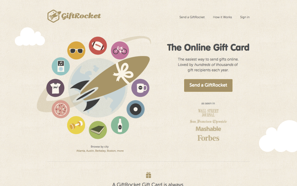
1. GiftRocket
The GiftRocket home page has it all. There’s fun graphics to catch your attention, and a clear call-to-action button that is immediately viewable to the visitor. The header explains succinctly what GiftRocket actually is, allowing visitors to figure out what the website is about without too much work on their part. There are also trust signals in the form of various media companies that GiftRocket has been seen in, making users see them as trustworthy right off the bat.
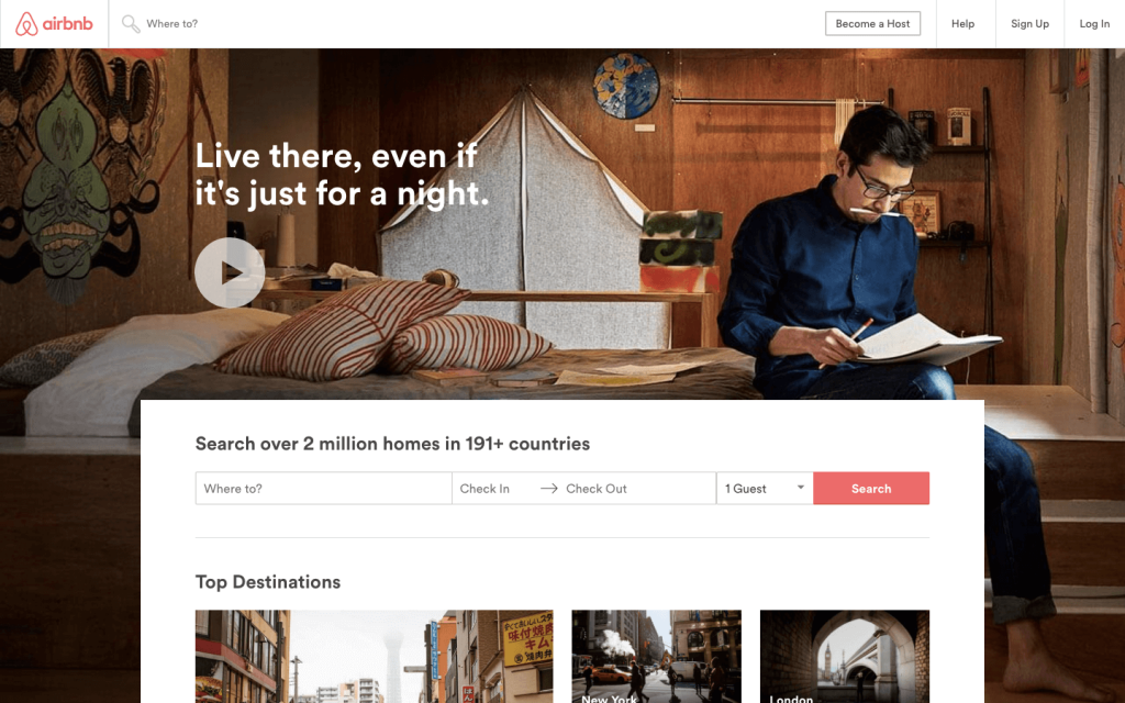
2. Airbnb
I love Airbnb’s home page for a lot of reasons, but the standout here is the video format. When you arrive on the Airbnb website, you are greeted with a video that shows scenery from various places as well as people doing things like cooking, playing with kids, and arranging flowers. The whole thing is overlaid with the text “Live There”. It captures the spirit of Airbnb: traveling somewhere and getting the feel for actually living in that place by staying in a home rather than a hotel. It does a great job of summing up the company as well as inspiring you to start planning your next vacation. There’s a simple bar along the bottom that allows visitors to type in their destination and dates and find the perfect house for them. This home page is both easy to use, with a clear call-to-action, but it’s also very unique.
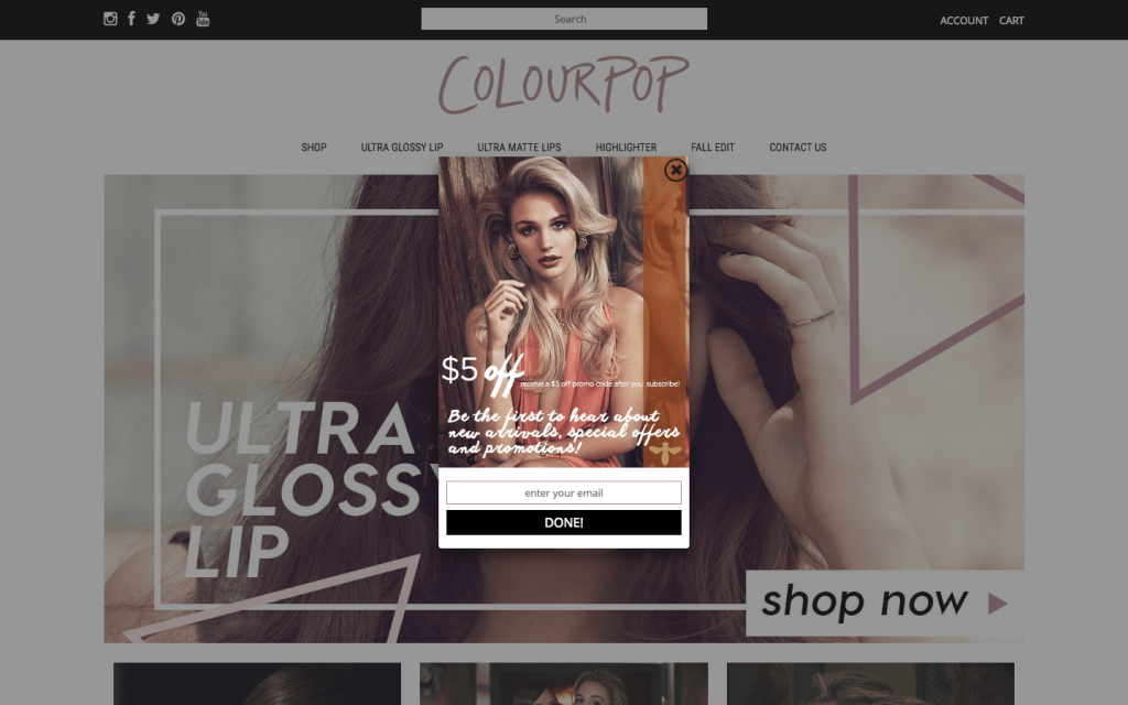
3. Colourpop
Colourpop’s home page automatically presents you with a 5 dollar off offer; all you have to do is put in your email! This is a good way of collecting visitor’s emails and enticing them to purchase something, since they have a coupon. This call-to-action is especially effective because they’re offering a reward for subscribing. In addition to this, Colourpop’s images do a good job of capturing the essence of the brand. They’re a makeup company, and various photos of glamorous young women fit into that brand identity. Their social media icons are also immediately visible, making it easy for people to find them in different places.
4. Game On
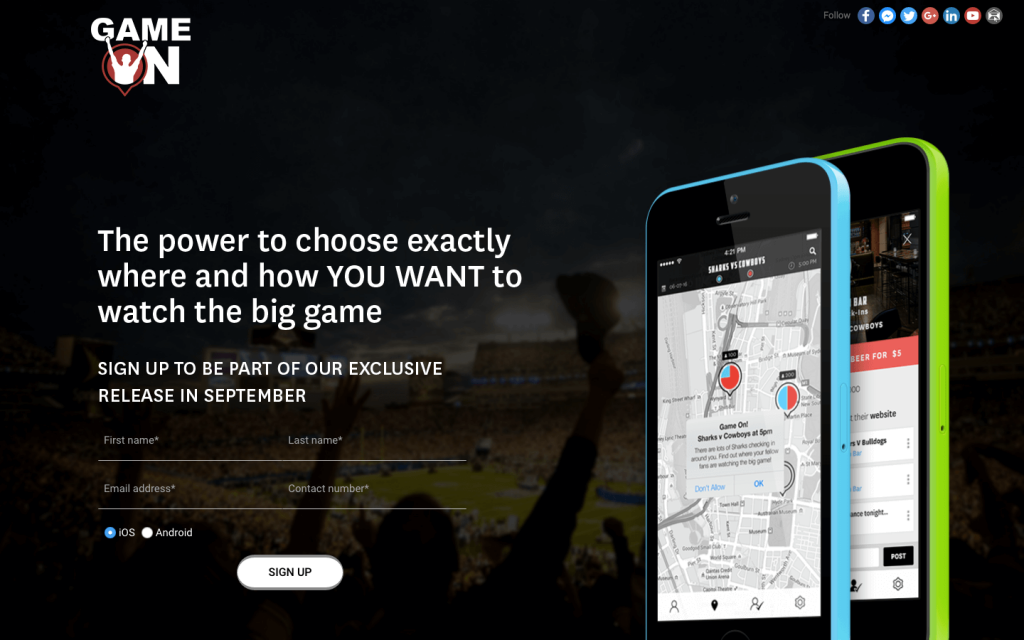
This is a landing page we designed for our client, Game On to promote their new app. This landing page gives you a quick idea of what this business does through their headline. It presents visitors with a place to subscribe right away, and by using the word “exclusive”, makes them want to sign up so they don’t miss out. We made use of big, bold images that help users understand what it exactly is that Game On does. As a result, the page isn’t cluttered or trying to do too much. This landing page does exactly what a landing page should do: presents visitors with a strong call-to-action and a good idea of what the business does.
5. Spotify
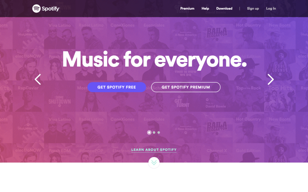
Spotify does a good job here of presenting their most important benefit: music for everyone. You can see various artists’ and genres in the background, reinforcing the idea that there’s something for everyone on Spotify. I also like that everything is presented in pink and purple tones. It allows Spotify to present a lot of their different options without it becoming too chaotic, since everything has the same colour scheme laid over it. In addition, there are two clear call-to-action buttons presenting the two different options the music service offers. This home page keeps it simple but still manages to capture what Spotify is all about and how you can enjoy it.
6. Todoist
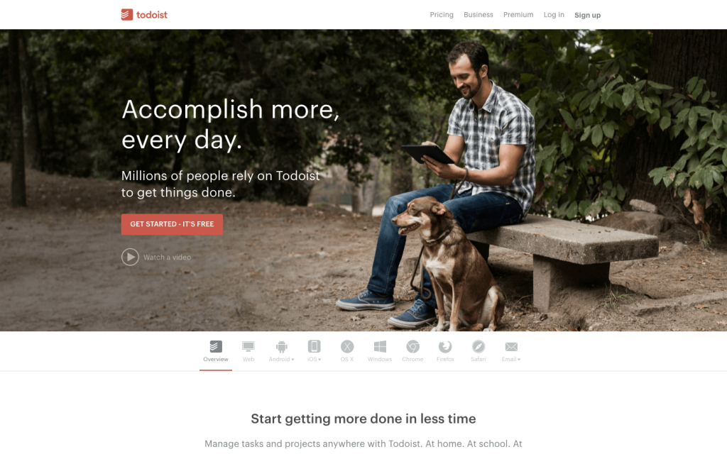
This website home page immediately presents the benefit of joining. It’s simple, bold headline says what they can do for you, which is what visitors are looking for. The page is relatively simple, with only an image overlaid with two sentences and a sign up button. This makes it easier for visitors to convert, since they don’t have to search for the button to press, and it promises to be free, which is always a bonus.
7. ASV Eurocar parts
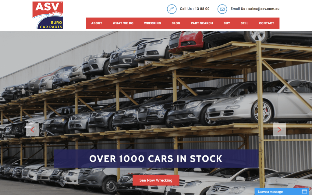
We created this website for ASV Eurocar parts, which features this beautiful home page makes it super easy to get in contact with them. The click to call and click to email buttons make it incredibly simple for visitors to the website to get in touch with the business, making them seem more approachable. They also have a contact us button and a space to leave a message, putting communication with the customer at the top of their priority list. ASV is heavy on the images, with a large, changing image taking up most of the home page. They don’t overload visitors with a lot of text right away and have chosen images that still do a good job of conveying what it is ASV does without using many words, making for a home page that isn’t overwhelming, but makes sure to welcome the customer. If you like this home page, get in contact with us! We just built the ASV website, and would love to help you get a home page (and overall website) that you love!
These are all examples of great home pages and hopefully provide some inspiration for a stellar home page of your own! To wrap things up, here are some of the qualities a great home page will have:
- A headline
- A way of summing up what you are offering
- Some type of supporting image or video
- A way to capture information like name and email
- A call-to-action
And there you have it! Take these examples and go create your perfect home page, or get in touch with us by sending us an email at hello@whitehatagency.com.au, we’d be happy to assist.
Recent Posts
Get your FREE 30 minute Digital Marketing Consultation.
Learn how you can grow your business by unlocking the full potential of Digital Marketing.
