Logo redesigns can sometimes be a part of life as a business. Your logo starts to look outdated, or your brand outgrows what your original logo represented. So what do you do when you realise your logo just isn’t right for you anymore? You redesign it! Your logo is one of the most visual elements of your business, and you want it to be something you’re proud of. If you find that’s no longer the case, maybe it’s time for a change. A good logo should be:
- Memorable
- Simple
- Timeless
- Versatile
- Appropriate
So if you’re finding your logo just doesn’t mesh with these things (like it’s too complex or starting to look dated), then it’s time to consider a new logo. The prospect of designing a new logo can be daunting, but it can be a good thing! Here are some companies who redesigned their logos with great success. So don’t be afraid to shake things up and go with a new logo if you think it’s time.
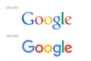
1. Google
When Google’s new logo came out, a lot of people freaked out. Logo redesigns can be a big step, especially in this case. Google is so omnipresent that a logo change was actually kind of a big deal. However, the new logo features sleeker lines, and updated text that makes the logo seem more modern. Change can be scary, but Google handled it with grace and ultimately revealed a logo that emulates Google itself: one that is fresh, modern, and not afraid to keep moving forward.
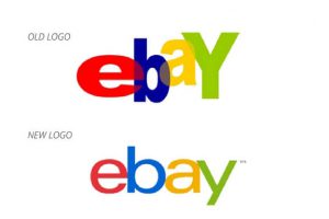
2. eBay
Here’s another example of a company taking a logo that was a little dated and giving it a cleaner look to make it seem like a fresher company. eBay’s old logo was starting to show its age, so they went ahead and changed it, making it seem more professional. I think this is a good thing, as eBay’s entire business is built on the trust of their users. People aren’t going to buy or sell things online through a company that they can’t trust, and I think the updated logo makes them seem more legitimate and serious. This is a good example of a company coming up with a relevant, appropriate logo for their user base.
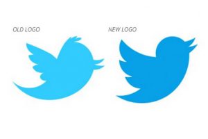
3. Twitter
Twitter’s iconic bird logo has gone through a few iterations. The most recent one is Twitter’s best, exemplifying all that Twitter as a company stands for. The new logo is sleeker, with fewer lines, removing one of the feathers and the hair from the bird. It is also flying upwards now instead of straight ahead. Twitter is all about being minimal (140 characters, anyone?) so it makes sense for them to adopt a sleeker looking logo that cuts down on any unnecessary bits. Twitter is also evolving the way we communicate and consume media, so it really encapsulates the brand identity to have the bird flying upwards, rather than staying static. This logo is a great example of a few changes that can have a big impact and better represent the brand.
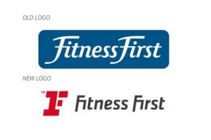
4. Fitness First
Fitness First is, as you might have guessed, a fitness company. Their new logo is clever and looks more like what you’d expect from a gym. The new logo combines a 1 and an F into one symbol to represent their company name. They also changed up the text, making it blockier. Their colour scheme also changed up, going from blue to red and black. This makes total sense, as blue is usually a calming colour, and red gets people more fired up, something you would want in a fitness club. Overall, the logo redesign makes for a better fit for the brand identity and the clever visual double meaning will be more likely to stick in people’s minds.
5. Yahoo!
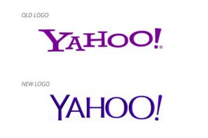
Yahoo managed to design a new logo that looks updated and fresh but still keeps the essential brand personality that the original logo possessed. The old logo was starting to look very dated, and, as a tech company, that’s the last thing Yahoo wants. Logo redesigns often work because they move in the same direction the company has. Yahoo updated their logo to look less old school, but still kept a fun personality present. The company did a good job of changing what was bad about the logo without getting rid of what was good about the logo.
6. Netflix
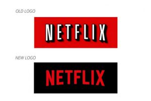
Netflix started primarily as a movie subscription service, where customers had DVDs mailed to their home. Now, it is a streaming service, making the switch to a more high-tech company. Over time, companies can change, and so can their primary purpose or identity. That’s totally okay, but with that identity change should come a logo change. Your logo should capture the spirit and identity of your brand, and if you start to see a shift in that area, it makes sense for your logo to shift along with it. Netflix did just this, streamlining their logo and welcoming in a new era for the company.
7. TGI Friday’s
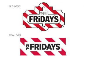
TGI Friday’s did what all successful logo redesigns should do. Remember what I said about simplicity? TGI Friday’s new logo does a great job of simplifying their design (so much so they even did away with punctuation). The old logo looked like something for an old-timey restaurant, and with cleaner typography and design shape, the new one looks fresh and sleek.
8. Microsoft
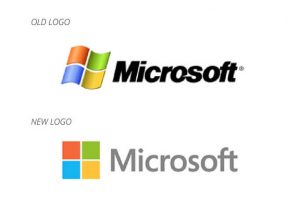
Another tech giant, another company for whom it’s essential to look as modern and updated as possible. Microsoft updated their logo to still include the iconic windows symbol (which now actually looks like a window and not a waving flag), but it’s now static. This makes the image look a little cleaner and less dated, as all good logo redesigns should do. They also changed the type to be cleaner, with less harsh lines. Overall, the logo looks less complex and thus more timeless. The replacement of the wavy window also makes it clearer what the symbol is supposed to represent, hopefully clearing up any lingering confusion.
Logo Redesign Takeaways
These are just a handful of successful logo redesigns, but what makes them work? For a lot of them, it’s updating what has become an outdated logo. A lot of these redesigns hinge on simplicity and making a cleaner, nicer logo. Another issue is a logo that just doesn’t mesh with the brand. Your logo should be a visual way of representing your brand identity, and a company can outgrow their logo.
Take some time to think about how your company has changed and evolved and what you want your logo to represent. For a few of these companies, their logo just wasn’t capturing the essence of the brand and needed to be changed. A logo redesign can be a scary undertaking, but sometimes it’s necessary to continue to present the best possible image of the brand. If you think it might be time for a logo redesign of your own, get in touch with us, we’d be happy to help!
Recent Posts
Get your FREE 30 minute Digital Marketing Consultation.
Learn how you can grow your business by unlocking the full potential of Digital Marketing.

