Looking for some website design inspiration? We all get stuck in a rut sometimes, but these websites will help give you a fresh perspective. No one wants a blah website, so if website design inspiration is what you’re after, you’ve come to the right place! Look no further than these websites, which combine aesthetics with functionality to pack some major punch.
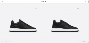
1. ETQ
ETQ is a shoe company whose entire business premise is classic and timeless design. Their website reflects this, with minimalist features. The design doesn’t try to be trendy, something that also emulates the brand as a whole. This is a good example of web design reflecting the company overall. ETQ’s website allows their shoes to be the main focus. It’s clean and easy to use, while still being visually pleasing.
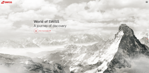
2. Swiss
Swiss Airlines nail their website. It’s visually stunning, and scrolling up allows you to see different services they offer and the story behind their airline. Not only is this “taking off” clever as it mimics the take-off of a plane, it makes the website incredibly easy to use, presenting a seamless overall experience.
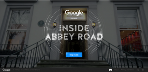
3. Inside Abbey Road
With Google behind it, it’s no wonder this website is so good. This website takes you behind the scenes of Abbey Road Studios, one of the most famous recording studios in the world. Using both visual and aural elements, this website offers an interactive look at how this studio came to be so famous, and all of the artists who have recorded in these hallowed halls.
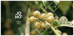
4. JOHO’s Bean
This coffee company does the impossible; it makes you emotionally and intellectually invested in a coffee bean. This website uses sound, video, and images to tell the story of a coffee bean’s journey. It’s something engaging and also different, which immediately draws in any visitors to the website.
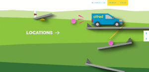
5. Alfred Service
Alfred Service is a dry-cleaning business based out of Toronto. This website somehow manages to spice up dry-cleaning and make this user experience a fun and interactive one. This website is perfect because it answers all of your questions without sacrificing aesthetics or creativity.
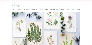
6. Leif Shop
This ecommerce site focuses on what really matters; the products its selling. Large, clear pictures allow the products to take center stage and as a result, makes it easy to see exactly what you’re getting. The easiest way to describe this website is pretty, making its products seem all the more appealing.
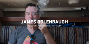
7. Minimums
Minimums entire premise is featuring the most interesting possessions of those they deem the most interesting people. Their website is heavily photograph based, and also uses a grid structure that makes the website look clean, keeping the images as the driving force behind each design choice. In addition, the images are stunningly clear, an important element in a photograph-based site.
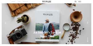
8. Woven Magazine
An online magazine, Woven breaks the content up into easily digestible stories without taking away from the impact of the stories themselves. In addition to written content, Woven features films, making it rich in visually engaging content. This website helps make online magazine reading (or viewing) easy.
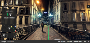
9. Night Walk with Google
Google once again knocks it out of the park. This website talks you on a nighttime walk around Marseille, with a tour guide talking you through the city’s hot spots. The visuals are stunning, the navigation is seamless, and the audio makes you feel like you’re really standing on a city street at night. This is fun to explore and also definitely appeals to the adventurer in all of us!
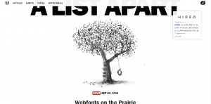
10. A List Apart
A List Apart isn’t flashy, but it doesn’t need to be. This website focuses on clean lines and bold text, making its articles easy to read. In addition, the topics are listed, so it’s easy to find the exact article you’re looking for. Sometimes, less really is more.
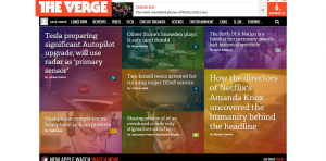
11. The Verge
Another online magazine, The Verge splits its stories into their own little colored blocks, making it both visually appealing and easy to use, rather than blocks of text. As online content reading becomes more common, its nice to see a website do something a little different that doesn’t compromise readability.
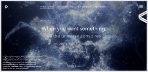
12. Feed Music
Feed blends animation and video for an engaging user experience online. The visuals are dynamic and the scroll bar doubles as the navigation bar, making the Feed web design sleek and compelling. In addition, the unique visuals capture the attention of visitors.
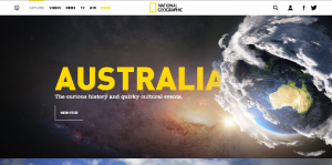
13. National Geographic
National Geographic is synonymous with stunning photography, so it only makes sense that the visuals on its website are just as beautiful. Large, crystal clear images couple with bold text to make a visually appealing website that makes it easy for everyone to find something they’re interested in.
So there you have it! These websites are examples of beauty and creativity combined into a knockout user experience. These different types of sites are sure to offer some website design inspiration. So get out there and get designing!
Recent Posts
Get your FREE 30 minute Digital Marketing Consultation.
Learn how you can grow your business by unlocking the full potential of Digital Marketing.

